

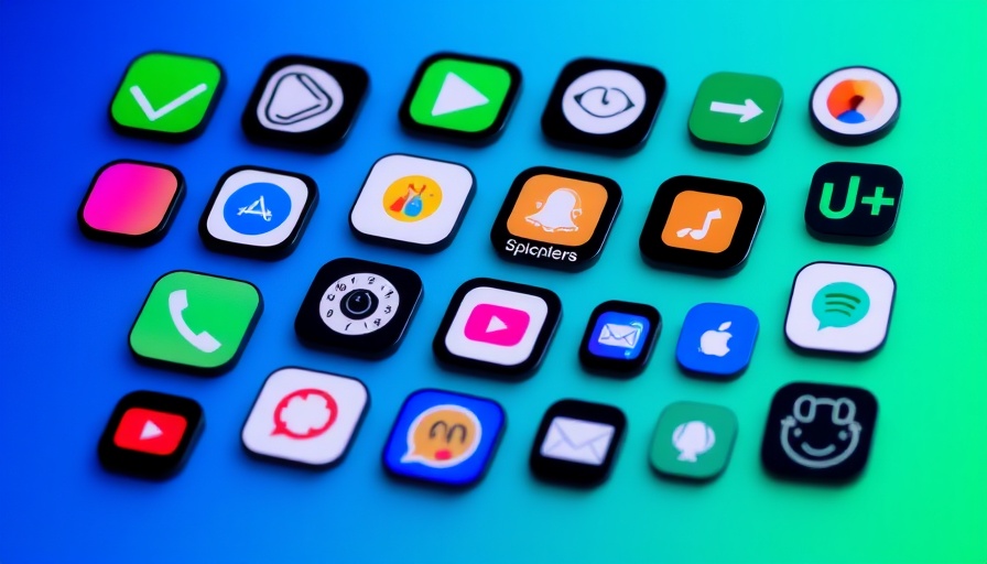
The Problem with iOS 26's Dark Mode Icons
Apple's iOS 26 has introduced a sleek, new design known as "Liquid Glass," and while the fresh aesthetic may appeal to many, it comes with an unexpected quirk: tilted dark mode app icons. Users have taken to platforms like Reddit to voice their irritation, noting how these icons appear slightly misaligned. The phenomenon, an optical illusion caused by uneven highlights in the icons, can disrupt the clean visual experience Apple aims to provide.
Taking a Closer Look at the Illusion
When viewed at a glance, the app icons may seem perfectly centered. However, the highlights around certain corners create a misleading effect that leads some users to feel dizzy or off-balance. The issue becomes particularly pronounced against darker backgrounds, where the brightness of the highlights stands out. Over lighter backgrounds, while still present, the highlights don't disturb the viewer as much due to lower contrast.
Why This Matters: The Impact on User Experience
For digital nomads and productivity enthusiasts, visual distractions can significantly affect focus and work efficiency. If such an annoyance is making you uncomfortable, it’s essential to address it to maintain productivity and mental clarity. Neglecting these small issues can lead to a ripple effect on your work performance, especially when you're on the road and using devices heavily.
Possible Quick Fixes for Your iOS 26 Icons
While Apple may eventually provide a system-wide fix for this quirk, there are several steps you can take in the meantime to mitigate the frustrating effect:
- Switch to Light Mode Temporarily: If the dark mode icon issue is bothersome, toggling to light mode can temporarily alleviate the problem. While this isn’t an ideal solution for everyone, it may offer some relief until an official update is rolled out.
- Select Different App Icons: Some users have found that changing the app icon (via the long-press menu) to alternatives, when available, helps reduce the noticeable tilting effects. Experimenting with this could lead to a more visually pleasing arrangement.
- Provide Feedback to Apple: If you're particularly affected, it might be wise to submit feedback through Apple’s feedback page. User input can be vital in prioritizing updates and fixes for upcoming releases.
The Bigger Picture: Enhancing User Engagement
This icon quirk reflects a broader trend in tech design, where the pursuit of aesthetics sometimes overshadows user experience. As technology continues to evolve, striving for a balance between visual appeal and functionality is crucial. Stay engaged in the community discussions, as these dialogues often lead to user-initiated solutions and improvements.
Moving Forward in Dark Mode
Dark mode has been celebrated for its ability to reduce eye strain and improve battery life on OLED screens. However, as with any software, occasional bugs and issues will arise. Staying informed about these problems—and their temporary solutions—can significantly enhance your overall experience with your devices. This way, your productivity remains intact, keeping you prepped and focused on tasks at hand.
Call to Action: Adapt Your Digital Environment
As digital nomads constantly adjusting to new environments, it's the little things that can make a difference in productivity. Stay ahead by experimenting with fixes for the iOS 26 dark mode icon issue and provide feedback to help shape future updates from Apple. A small adjustment now can facilitate a smoother workflow, ensuring your tech continues to support your busy lifestyle.


Write A Comment