Add Row
Add Element
cropper
update

{COMPANY_NAME}

Digital Nomad Weekly logo
update
Add Element
  • Home
  • Categories
    • Productivity
    • Health
    • Packing
    • Food
    • Wellness
    • Workspaces
    • Culture
September 20.2025
3 Minutes Read

Unlocking Productivity: How Garmin’s Lifestyle Logging Can Enhance Your Wellness

Garmin lifestyle logging feature interface on smartphone.

Garmin’s Lifestyle Logging Feature: A Game Changer for Health Tracking

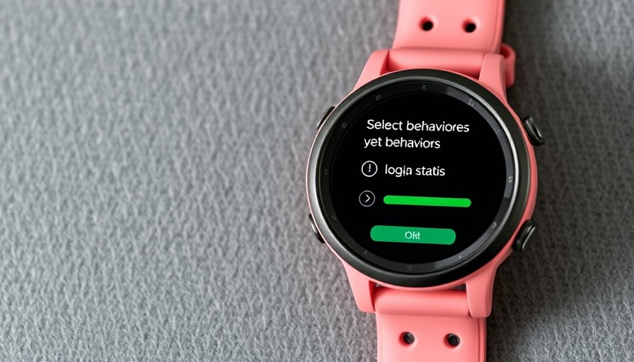
Garmin has made strides in health technology with the introduction of its "lifestyle logging" feature, which was notably showcased with the Venu 4. However, this innovative capability isn't limited to just that model; it is now available for all users of HRV-capable Garmin devices. This broadens access for many, allowing Garmin to compete more effectively with popular health trackers like Whoop.

What is Lifestyle Logging and How Can It Benefit You?

At its core, lifestyle logging allows users to track various habits and behaviors that might influence their health metrics. For instance, you can log your caffeine or alcohol intake and analyze how these habits impact your sleep quality. This capability helps you gain insights into your daily routines and how they affect your overall wellness.

Comparing Garmin's Feature with Competitors

Whoop, known for its in-depth recovery insights and an expensive subscription model, has offered a similar feature for quite some time. Its system precisely breaks down the effects of individual habits on recovery metrics. One significant difference is that Whoop gives users an extensive analysis of how lifestyle choices impact not only sleep but also performance metrics like heart rate variability (HRV) and stress levels.

Understanding the Data: What Can You Learn?

Garmin's lifestyle logging generates reports that outline how your documented behaviors affect your sleep score, overnight HRV, and overnight stress levels. While this data is invaluable, it's crucial to remember that correlation does not imply causation. For instance, though you may find that taking melatonin could correlate with poor sleep, it is essential to explore other underlying factors, such as your overall environment or stress levels.

A Broader Look: Integrating Multiple Health Metrics

Despite the limitations, Garmin’s feature represents a significant enhancement to health tracking. Unlike some competitors, Garmin does not yet offer insights on how these behaviors might affect athletic performance during the day. However, for those actively monitoring their wellness as digital nomads juggling productivity and health, the insights provided can inform better lifestyle choices.

Future of Fitness Tracking: Trends to Keep an Eye On

The rollout of Garmin's lifestyle logging signals a broader trend in the fitness tech market: the move toward holistic health tracking. Wearable technologies are increasingly focusing not just on physical stats, but on lifestyle behaviors that influence wellness. This shift emphasizes the importance of personal responsibility in managing health, where understanding daily habits becomes integral to overall performance.

As tools continue to evolve, we can expect greater integration between wearable tech and productivity applications, offering tailored insights for users seeking to optimize their health and efficiency in a remote work environment.

Actionable Insights: How to Maximize This Feature

For digital nomads looking to enhance their productivity, leveraging Garmin’s lifestyle logging can be highly beneficial:

  • Log Regularly: Be consistent in tracking your habits to understand patterns over time.
  • Analyze Reports: Regularly review the reports generated by the Garmin app to identify positive and negative correlations.
  • Integrate with Your Routine: Adjust your daily tasks and health practices based on your logging results, ultimately designing a lifestyle that promotes better productivity and wellness.

Ultimately, whether you're a seasoned remote worker or just starting your journey, understanding how your behaviors impact your performance can help streamline your productivity. And now, with Garmin’s expanded capabilities, there's even more opportunity for beneficial change.

For those interested in optimizing their productivity and health, dive into Garmin's lifestyle logging and start understanding how your daily choices impact your life.

Productivity

Write A Comment

*
*
Related Posts All Posts
09.20.2025

Unlock the Full Potential of Your iPhone Air: Extend Battery Life

Update Maximizing Your iPhone Air Battery Life: Simple Adjustments The new iPhone Air is certainly a marvel, with its ultra-slim design and powerful capabilities. However, many users are concerned about its battery life, which has seen a slight downgrade from previous models. Despite Apple's claim of up to 27 hours of video playback, real-world usage often tells a different story. To ensure you’re getting the most out of your iPhone Air's battery, let's dive into practical settings adjustments that digital nomads can implement to enhance productivity. Turn on Low Power Mode One of the quickest ways to stretch your iPhone's battery life is to activate Low Power Mode. By simply swiping down from the top right corner of your Home Screen and tapping the battery icon in the control center or navigating to Settings > Battery > Power Mode, you’ll easily toggle this feature. While in Low Power Mode, you will see some restrictions, such as reduced background activities, lower screen brightness, and deactivation of certain features like 5G and iCloud sync. However, these sacrifices can significantly prolong your battery duration in critical situations. Optimize Background Activity Another vital step in preserving battery life is managing your app’s background activity. Many apps continue running processes in the background, draining battery life. Heading to Settings > General > Background App Refresh, you’ll find options to allow background activity only on Wi-Fi, or even turn it off entirely for individual apps. This is a fantastic way to ensure that only essential applications consume your battery power. Adjust Screen Brightness and Auto-Lock Settings Your screen is one of the most significant battery consumers on the iPhone. By heading to Settings > Display & Brightness, you can reduce your display brightness or enable Auto-Brightness. Auto-Brightness adjusts your screen intensity based on ambient light, providing a balance between visibility and battery efficiency. Moreover, adjusting your Auto-Lock settings to a shorter duration, such as 30 seconds or 1 minute, can prevent your screen from staying on unnecessarily, which is another win for battery conservation. Limit Location Services GPS and location services are useful, especially for digital nomads navigating new environments. However, these features can also be significant battery drains. Go to Settings > Privacy > Location Services to limit how much access apps have to your location. Opt for options like “While Using the App” instead of “Always,” to significantly tighten how apps query your GPS. Battery Health Management Your iPhone also offers a way to monitor battery health. By navigating to Settings > Battery > Battery Health, you can see your battery’s maximum capacity and whether your iPhone is using software features to manage performance. If your battery health is below 80%, it might be worthwhile to consider a battery replacement for optimal performance. Be Mindful of Connectivity Settings The connectivity features, such as Bluetooth and Wi-Fi, can behave sporadically in terms of battery usage. Disabling these features when not in use can save a considerable amount of battery life. You can quickly access these settings via the Control Center. Make it a habit to toggle them off when you're not connected to the internet or not syncing devices. Conclusion: A Cost-Effective Approach to Maintaining Your Productivity For digital nomads, managing battery life effectively translates to maximized productivity, especially when working remotely. By following these essential settings adjustments, you can ensure your iPhone Air remains operational during crucial moments. Remember, a well-managed battery contributes to a smoother workflow, allowing you overall peace of mind as you pursue your tasks. Your journey with your iPhone Air can be as productive as it is innovative. By adopting these battery-saving habits, you pave the way for less downtime.

09.19.2025

Mastering Google Sheets Sparklines: Visualize Your Data with Ease

Update Unlock the Power of Sparklines: Your New Data Visualization Tool As digital nomads, our lives are a blend of flexibility and productivity challenges. We often juggle multiple projects and data sets, and staying organized while making sense of our data can be overwhelming. Enter Google Sheets' Sparklines: a simple yet powerful feature that transforms raw data into visual insights packed into a single cell. Imagine the satisfaction of spotting trends and patterns at a glance! This ability allows you to make quick decisions without digging through mounds of data. Visualizing Trends with Minimal Clutter At the heart of the SPARKLINE function in Google Sheets is its capability to condense an entire chart into the confines of a single cell. Instead of cluttering your spreadsheets with extensive graphs, Sparklines create miniature visualizations. With a simple formula like =SPARKLINE(range), you can visualize data from rows seamlessly. For instance, if you monitor your productivity or sales over time, seeing a line graph emerge right next to your data can provide immediate insights into your performance trends without distraction. Multiple Chart Types: Tailoring Your Visualization What sets Sparklines apart is their flexibility. You can easily showcase data in different formats depending on your needs—be it a line chart, column chart, or stacked bar chart. For example, when comparing test scores across different subjects, a stacked bar Sparkline can vividly illustrate how well students perform in comprehension, summary, and vocabulary, all within one tidy cell. The syntax for this is straightforward: =SPARKLINE(B2:D2, {"charttype","bar"}) This transforms your cell into a meaningful visualization that highlights contributions to overall performance, allowing you to make informed adjustments to your teaching strategies. Customization to Enhance Understanding Beyond basic functionalities, you can tweak Sparklines for better readability and insights. Google Sheets allows you to customize colors, set value scales, and even manage how it treats empty cells. For instance, consider this enhanced formula: =SPARKLINE(B2:D2,{"charttype","bar"; "max",80; "color1","blue"; "color2","black"; "empty","ignore"}) Such adjustments help your team grasp the data quickly, which is vital for fast-paced decision-making environments characteristic of remote work. Bringing Clarity to Your Data Choosing the right type of Sparkline can emphasize crucial aspects of your data. Column Sparklines are excellent for displaying highs and lows, allowing immediate identification of outstanding performances or areas needing improvement. Whether you're tracking sales, project completions, or personal goals, these visual cues can significantly enhance clarity in your reports. Why Sparklines Matter for Digital Nomads In the realm of remote work, efficiency and clarity are king. The ability to visualize your data compactly not only keeps your heat maps tidy but fosters a deeper understanding across teams, which is essential for collaborative environments. As digital nomads, navigating the complexities of global projects demands tools that offer both functionality and intuitive use. Practical Tips for Integrating Sparklines into Your Workflow If you haven't tried integrating Sparklines into your spreadsheets yet, now is the time! To get started, practice inserting simple Sparklines within your daily data sets. Experiment with various chart types and customization options to discover what enhances your understanding best. Consider setting up a summary sheet that combines multiple Sparklines for an at-a-glance overview of your progress across various metrics. In today’s data-rich world, mastering tools like Sparklines is not an option but a necessity for those of us thriving in remote workspaces. They not only save space and simplify reporting but also make your insights more impactful—enabling you to work smarter, not harder. Make Data Visualization a Habit As you continue to navigate your remote work environment, embracing data visualization with tools like Sparklines can transform your approach to productivity. The more comfortable you become with these tools, the more confidently you can interpret your data and make informed decisions. Ready to take your Google Sheets experience to the next level? Start utilizing Sparklines today and see the benefits of clarity and understanding in your data!

09.19.2025

Why Transforming Your Obsidian Notes into Charts Elevates Productivity for Digital Nomads

Update Transforming Text into Visuals: A Game Changer for ProductivityIn the digital age, our productivity tools often become a source of frustration rather than inspiration. Many digital nomads, when overwhelmed by endless text lists and spreadsheet-like trackers, find it challenging to maintain motivation. However, the shift from text-based tracking to visual representation can transform the way we engage with our data. Recently, I discovered how to turn my Obsidian notes into compelling charts, and it has significantly improved not just how I track my progress but also my overall motivation and productivity.Why Visual Tracking is Essential for Digital NomadsFor those constantly on the move, finding effective ways to track progress and manage goals is crucial. Text-heavy logs can often feel monotonous and uninviting, which is why transforming this data into engaging visuals can revolutionize the experience. As someone who thrives on the freedom of remote work, I can attest that visual progress tracking is not merely aesthetic; it opens up insight into patterns of productivity and areas for improvement. Imagine seeing your daily accomplishments as vibrant charts instead of long, tedious paragraphs.The Power of Obsidian Plugins for Visual TrackingWhat makes Obsidian incredibly useful is its extensive library of community plugins. By leveraging the right combination of plugins, I was able to turn my static notes into dynamic dashboards that showcase my goals and habits visually. The Tracker plugin is a standout. It specializes in habit and goal tracking, utilizing heatmaps and calendars that automatically update as you document your daily entries. Meanwhile, the Dataview plugin lets you create highly customized charts through JavaScript, allowing for endless possibilities as you refine your visual displays.Organizing Your Data for Maximum EfficiencyTo effectively harness the power of these plugins, you need a solid data organization structure. In my Obsidian vault, I created three folders: "Daily Notes," "Templates," and "Trackers." Each serves a pivotal role in not only making my notes more manageable but ensuring that my charts pull accurate information seamlessly. The Daily Notes folder contains my actual entries, the Templates folder holds standardized tracking templates, and the Trackers folder serves as the home for all visualizations. Ensuring these folders work in harmony with the plugins allows for real-time updates and a smoother tracking process.Creating Templates: A Time-Saving StrategyEfficiency is the name of the game for digital nomads, and creating a daily notes template was a game changer for me. This template ensures that I can log my habits in a structured manner without missing a day. It’s a simple step that saves time and helps maintain discipline. With a solid template in place, entering data becomes a streamlined process, removing the mental burden of figuring out what to log each day.Enhancing Your Productivity with VisualsAs I integrated these visual elements into my daily routine, I noticed a significant shift in my motivation. Tracking became less of a chore and more of an engaging task that I looked forward to. The bright charts not only make the data easier to digest but also encourage me to enhance my productivity further. Seeing my trends visually presented has helped me identify periods of low productivity, prompting me to reassess and adjust my daily habits accordingly.Final Thoughts and Action StepsBuilding an effective habit and goal tracking system using Obsidian's visualization capabilities is more than just a way to beautify your notes; it’s about fostering a deeper connection with your productivity journey. If you’re ready to elevate your tracking game, consider experimenting with the Tracker and Dataview plugins. With just a few adjustments to the way you organize and visualize your data, you can transform your approach to productivity. Embrace this toolkit and watch how it invigorates your motivation on the road!

Terms of Service

Privacy Policy

Core Modal Title

Sorry, no results found

You Might Find These Articles Interesting

T
Please Check Your Email
We Will Be Following Up Shortly
*
*
*